Tab
This Control is used to create multiple tabs on a Page in the application. When a tab is selected, the contents of the Tab are displayed, and any other open tab is hidden. It is effortless to create separate tabs in an application using this Control. In the following instance, we can switch between the Card view and Grid View by clicking the Tab on the top of the screen.
You have to go through a two-step form wizard to enable this Control, i.e., Design & Advance. Let’s explain these steps below:
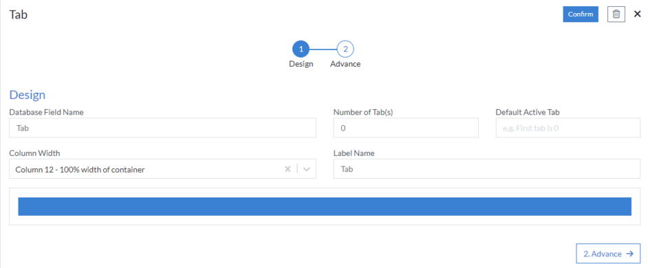
1st Step – Design
This is the first step of the “Tab” layout form wizard. Here you are required to fill in the following details:
- Database Field Name (mandatory): These are the attributes of the form
- Number of Tab(s): Number of tabs you want in page
- Default Active Tab: Mostly used in case when a user wants to set a tab as the default tab on a page. If nothing is mentioned than first tab is default
- Column Width
- Label Name
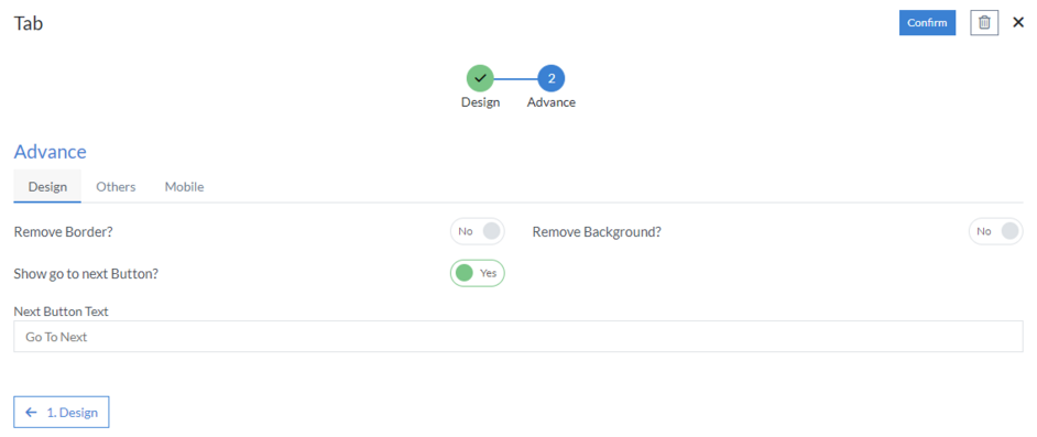
2nd Step – Advance
- Design
- Remove Border
- Remove Background
-
Show go to next Button
- Next Button Text
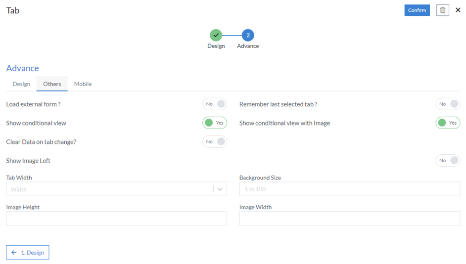
- Others
- Load external form?: If the user wants to load an external form in tabs
- Remember last selected tab
-
Show conditional view: Tab can be shown as conditional view
with options like “Yes” or “No.”
- Clear Data on tab change
-
Show conditional view with Image
- Show Image Left
- Tab Width
- Background Size
- Image Height
- Image Width
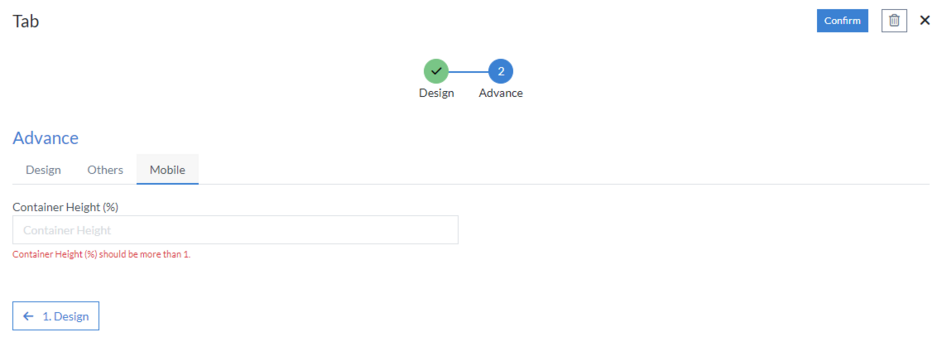
- Mobile
- Container Height (%)
Click “Confirm” and “Tab” control is configured.