Date
You have to go through a three-step form wizard to enable this Control, i.e., Design, Validation & Advance. Let’s explain these steps below:
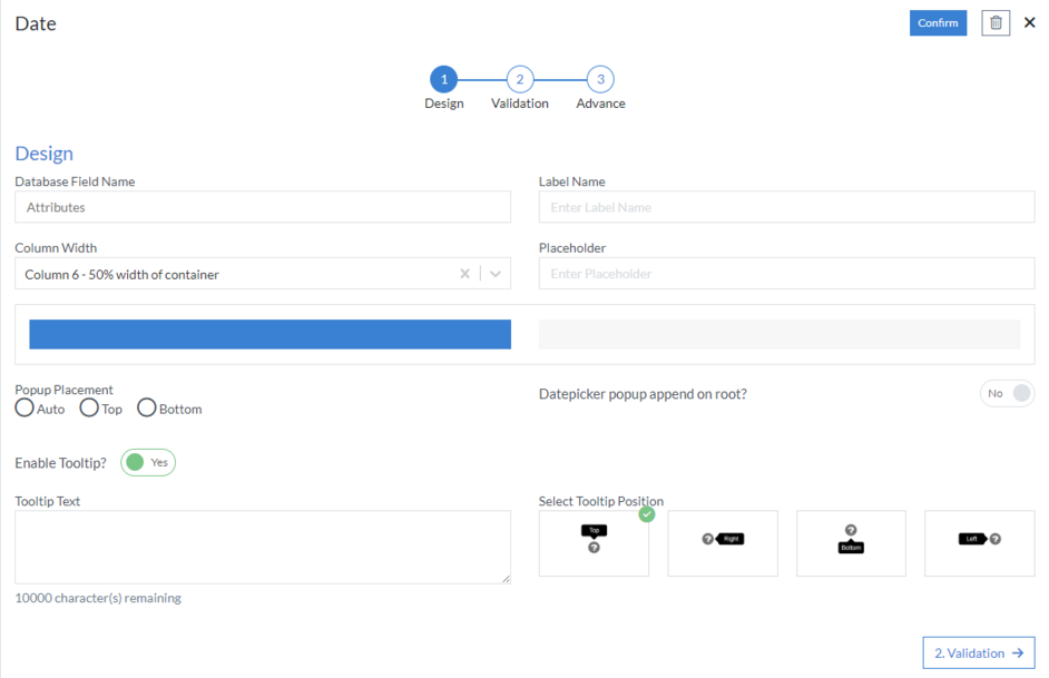
1st Step – Design
This is the first step of the “Date” control form wizard. Here you are required to fill in the following details:
- Database Field Name (mandatory): These are the attributes of the form
- Label Name
- Column Width
- Placeholder
- Popup Placement: Here, you define the direction of the date selection popup
- Datepicker popup append on root
-
Enable Tooltip?: This button is set as “Yes” if you need to
enable Tooltip Text in this Control
- Tooltip Text
- Select Tooltip Position: Select tooltip position from the following Top, Right, Bottom or Left
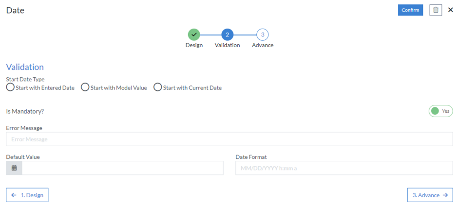
2nd Step – Validation
- Start Date Type: Here, you define the date type
-
Is Mandatory?: This button is set as “Yes” if you need to apply
this Control as mandatory
- Error Message: Here, you can define the error message that will be displayed if this control is left blank.
- Default Value: As the name suggests, it defines a default value for a field. This default value can be changed by user input.
- Date Format
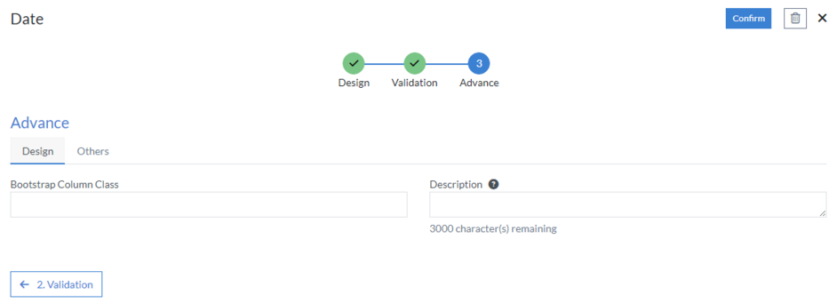
3rd Step – Advance
- Design
- Bootstrap Column Class
- Description: Enter extra suggestions for user experience on this field
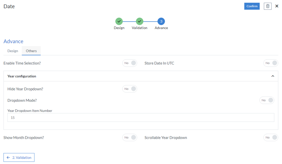
- Others
- Enable Time Selection?: Here, you specify if you need to enable the “Time Selection” option
- Store Date in UTC
-
Year configuration
- Hide Year Dropdown
- Dropdown Mode
- Year Dropdown Item Number
- Show Month Dropdown
- Scrollable Year Dropdown
Click “Confirm” and “Date” control is configured.