Label
This control is used for fields where you want to show text on the form as Labels and no input from users is involved or you want to display non-editable data from GET API on the form.
You have to go through a three-step form wizard to enable this Control, i.e., Design, Validation & Advance. Let’s explain these steps below:
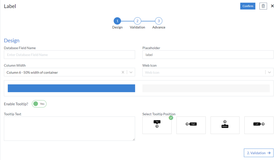
1st Step – Design
This is the first step of the “Label” control form wizard. Here you are required to fill in the following details:
- Database Field Name (mandatory): These are the attributes of the form
- Placeholder
- Column Width
- Web Icon
-
Enable Tooltip?: This button is set as “Yes” if you need to
enable Tooltip Text in this Control
- Tooltip Text
- Select Tooltip Position: Select tooltip position from the following Top, Right, Bottom or Left
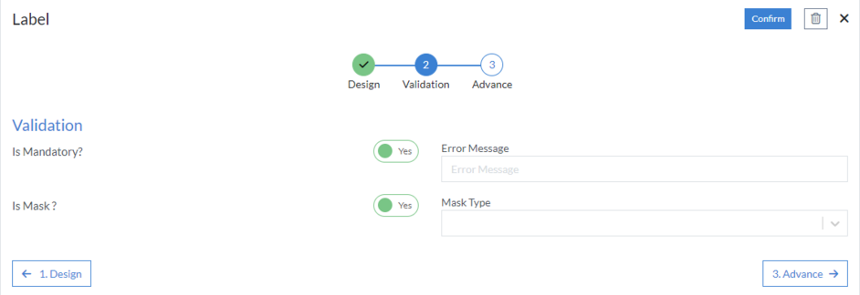
2nd Step – Validation
-
Is Mandatory?: This button is set as “Yes” if you need to apply
this Control as mandatory
- Error Message: Here, you can define the error message that will be displayed if this control is left blank.
-
Is Mask
- Mask Type
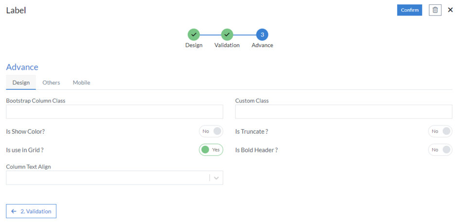
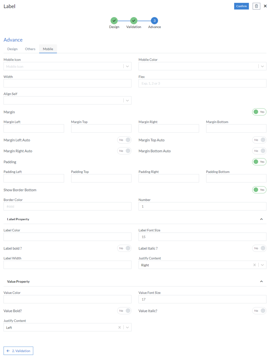
3rd Step – Advance
- Design
- Bootstrap Column Class
- Custom Class
- Is Show Color
- Is Truncate?: Choose when you want to truncate the text
-
Is use in Grid?: Use this property when the Label is added in
a Grid. When selected "Yes", you shall have to further
configure the Text alignment of the Label in the Grid.
- Is Bold Header
- Column Text Align
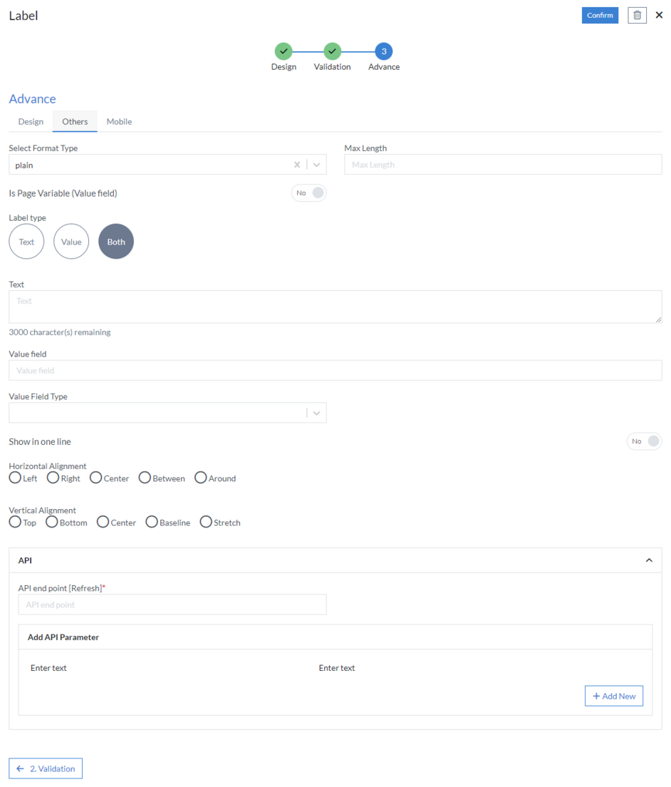
- Others
- Select Format Type: Select format type from the following H1, H2, H3, H4, H5, H6 , P, Plain Text
- Max Length: It is used when we want to limit the number of characters that can be displayed on the screen
- Is Page Variable (Value field)
- Label type: Choose from Text (for only Text), Value (To bind value from GET API) or Both (Display both Text and Value)
- Text: Type the “Text” that you want to display
- Value field: Put the attribute from GET API whose value you want to be displayed
- Value Field Type: Choose from Number, Text, Date, Time, Date and Time, Email, Phone, Website, Address, etc.
- Show in one line
- Horizontal Alignment: Select horizontal alignment from the following Left, Right, Center, Between or Around
- Vertical Alignment: Select vertical alignment from the following Top, Bottom, Center, Baseline or Stretch
-
API
- API end point [Refresh] (mandatory)
- Add API Parameter
- Mobile
- Mobile Icon
- Mobile Color
- Width
- Flex
- Align Self: Select align self from the following Auto, Top, Center, Bottom or Stretch
-
Margin
- Margin Left
- Margin Top
- Margin Right
- Margin Bottom
- Margin Left Auto
- Margin Top Auto
- Margin Right Auto
- Margin Bottom Auto
-
Padding
- Padding Left
- Padding Top
- Padding Right
- Padding Bottom
-
Show Border Bottom
- Border Color
- Number
-
Label Property
- Label Color
- Label Font Size
- Label Bold
- Label Italic
- Label Width
- Justify Content: Select from the following Left, Right, Center, etc.
-
Value Property
- Value Color
- Value Font Size
- Value Bold
- Value Italic
- Justify Content: Select from the following Left, Right, Center, etc.
Click “Confirm” and “Label” control is configured.