Number
You have to go through a three-step form wizard to enable this Control, i.e., Design, Validation & Advance. Let’s explain these steps below:
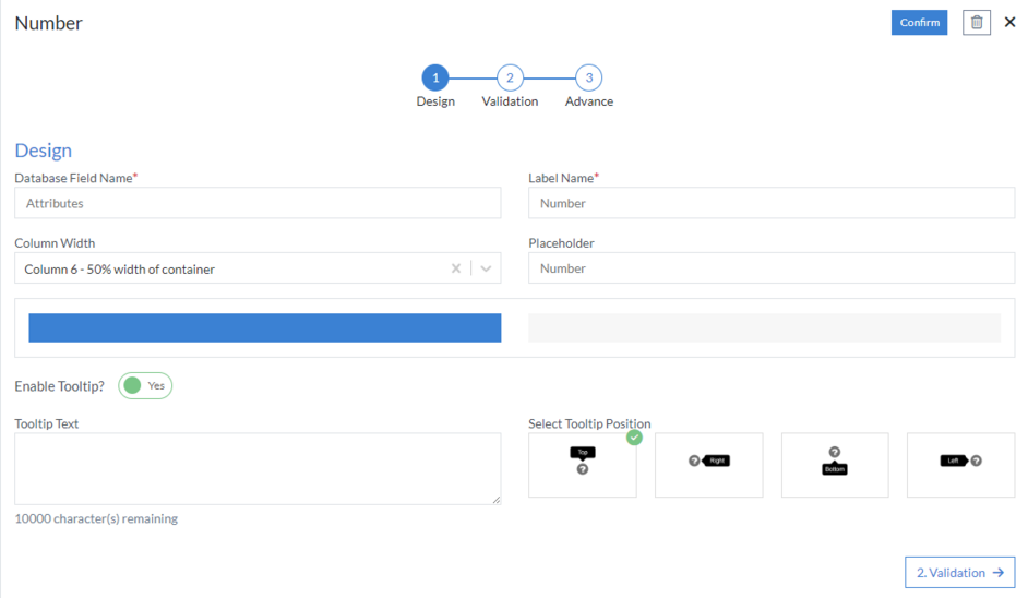
1st Step – Design
This is the first step of the “Number” control form wizard. Here you are required to fill in the following details:
- Database Field Name (mandatory): These are the attributes of the form
- Label Name (mandatory)
- Column Width
- Placeholder
-
Enable Tooltip?: This button is set as “Yes” if you need to
enable Tooltip Text in this Control
- Tooltip Text
- Select Tooltip Position: Select tooltip position from the following Top, Right, Bottom or Left
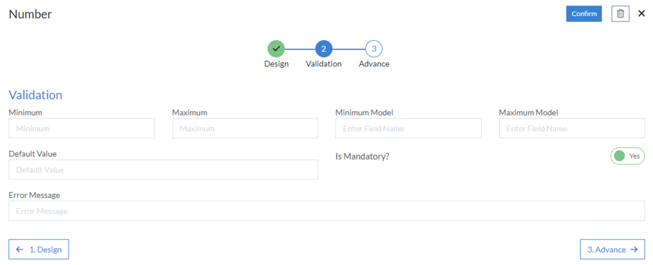
2nd Step – Validation
- Minimum: Minimum Value that can be accepted by user input
- Maximum: Maximum Value that can be accepted by user input
- Minimum Model: Here, we enter field name (attribute) from the form, which will define the minimum value that can be acquired by user input
- Maximum Model: Here, we enter field name (attribute) from the form, which will determine the maximum value that can be accepted by user input
- Default Value: As the name suggests, it defines a default value for a field. This default value can be changed by user input.
-
Is Mandatory?: This button is set as “Yes” if you need to apply
this Control as mandatory
- Error Message: Here, you can define the error message that will be displayed if this control is left blank.
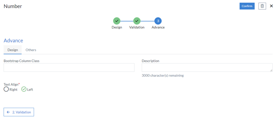
3rd Step – Advance
- Design
- Bootstrap Column Class
- Description: Enter extra suggestions for user experience on this field
- Text Align (mandatory): Right or Left
- Others
- Format Type: Number or Currency
- Use 1000 Separator (,)
- Decimal Places
- Negative Numbers
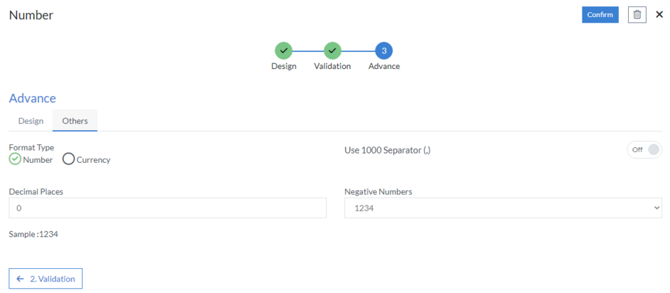
Click “Confirm” and “Number” control is configured.