Calendar
You have to go through a three-step form wizard to enable this Control, i.e., Design, API & Advance. Let’s explain these steps below:
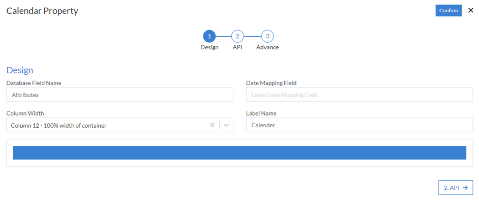
1st Step – Design
- Database Field Name (mandatory): These are the attributes of the form
- Date Mapping Field
- Column Width
- Label Name
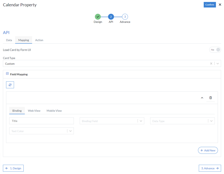
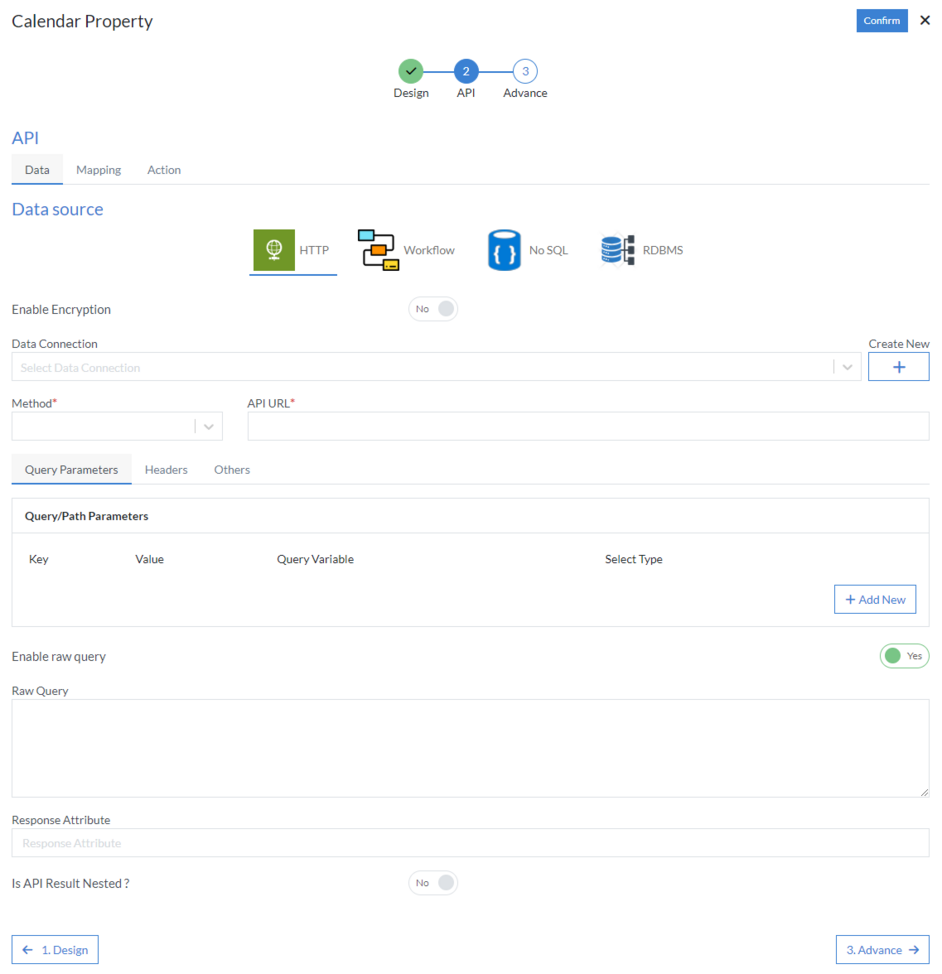
2nd Step – API
- Data
-
Data Source: Select data source from the following HTTP,
Workflow, No SQL or RDBMS
-
HTTP
- Data Connection
- Method (mandatory): Select method from the following GET, PUT, POST, PATCH, DELETE or POCO
- API URL (mandatory)
-
Query Parameters
- Key
- Value
- Query Variable
- Select Type
-
Headers
- Name
- Value
-
Others
- Enable raw query
-
HTTP
- Enable Encryption
- Response Attribute
- Is API Result Nested
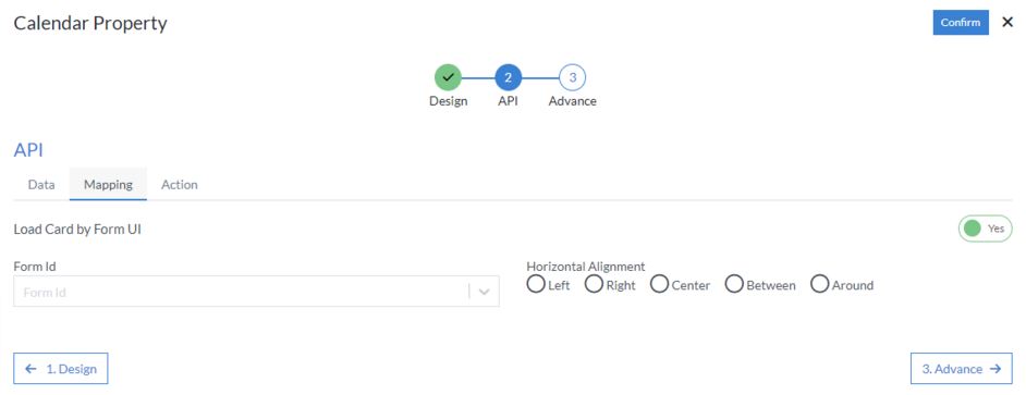
- Mapping
-
Load Card by FormUI: This is used to configure card grid using
a Custom Card design
- Form Id
- Horizontal Alignment: Choose alignment from the following Left, Right, Center, Between or Around
- Card Type: There are certain cards designs to choose from like List, Photo, Backdrop, Large, Profile, Contact, Product, Dynamic, etc.
-
Field Mapping: Click on “Add New” button depending on how many
fields you want to map in the grid based on requirement. And
click the refresh button to reload the API response. After
that start mapping following fields:
-
Binding
- Label
- Data Field: From API
- Data Type: Choose data type from the following None, Email, Date, Title, SubTitle, Image, Header Image, etc.
- Text Color: Select option from the dropdown menu
-
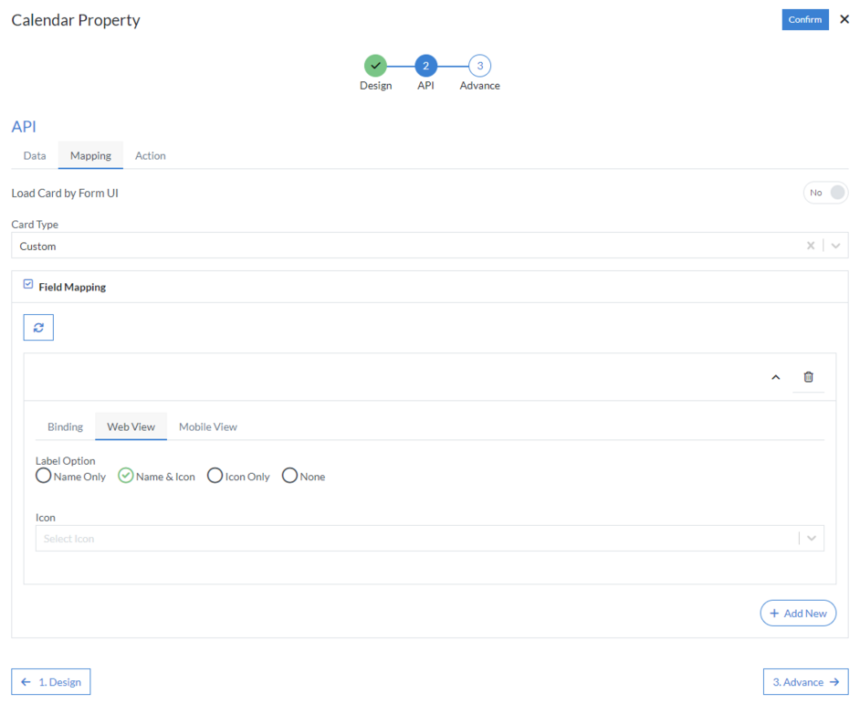
Web View
- Label Option: Select label option from the following Name Only, Name & Icon, Icon Only or None
-
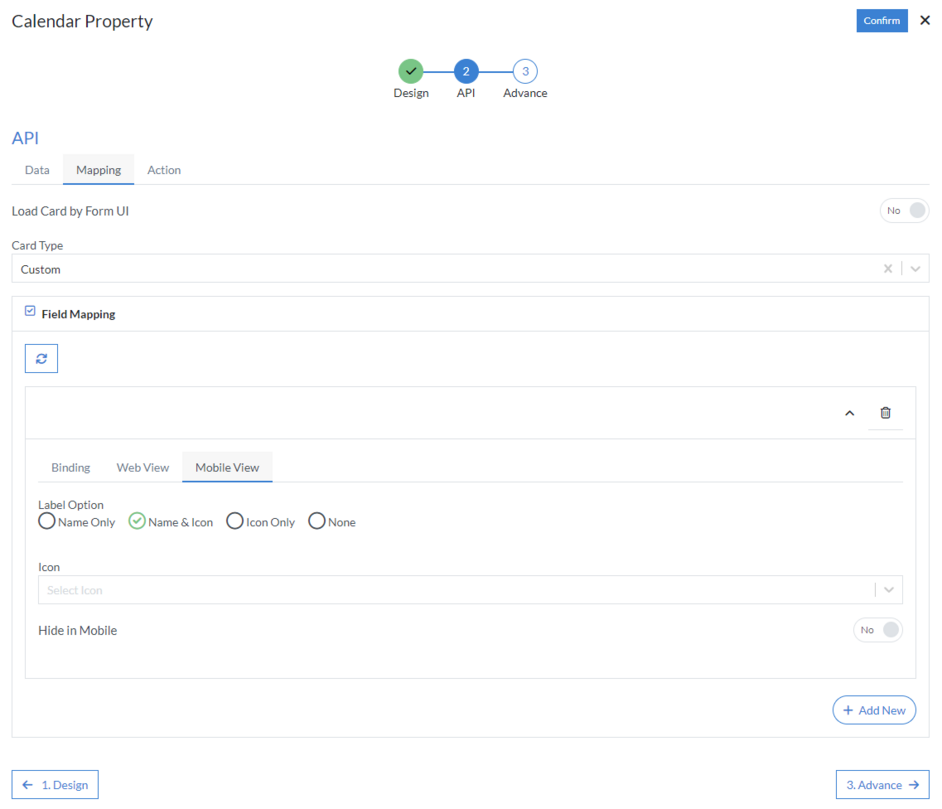
Mobile View
- Label Option: Select label option from the following Name Only, Name & Icon, Icon Only or None
- Hide in Mobile
-
Binding
- Action
-
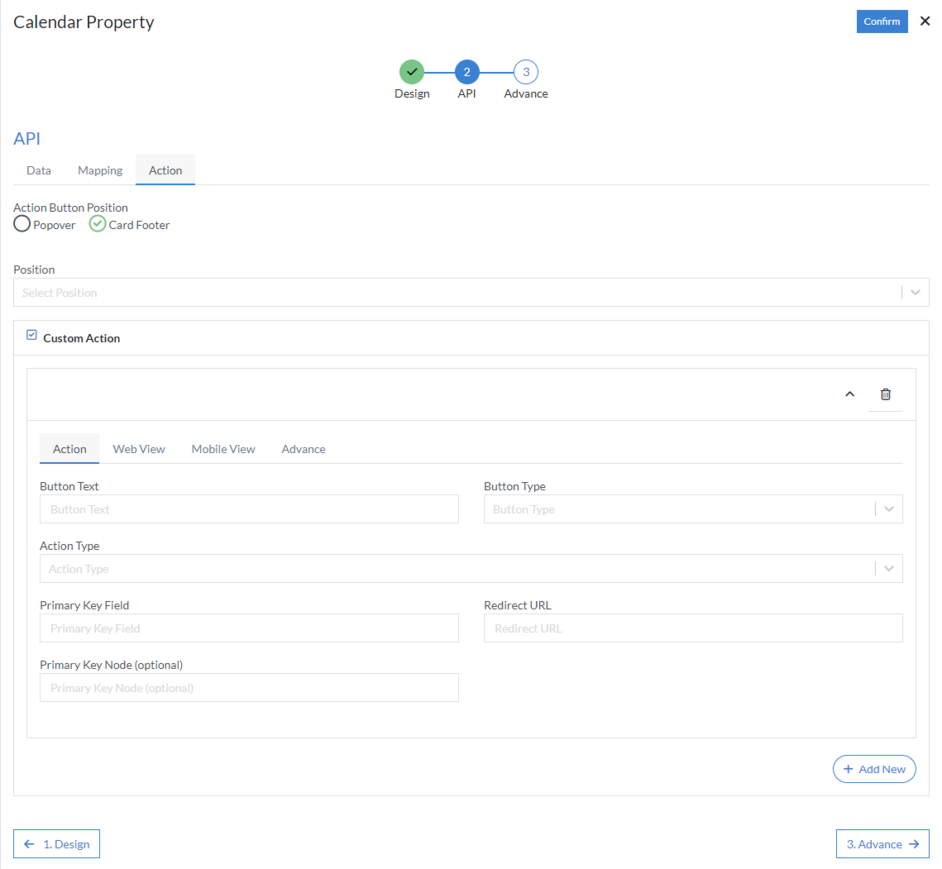
Action Button Position: Popover Or Card Footer
-
Card Footer
- Position
-
Card Footer
-
Custom Action: Click on “Add New” button depending on how many
actions you want to configure on the card based on
requirement. Then configure the following details:
-
Action
- Button Text
- Button Type: Select option from the dropdown menu
- Action Type: Choose action type from the following Sidebar, New Tab, Same Tab, Popup Window, Submit, Submit & Redirect, etc.
- Primary Key Field
- Redirect URL
- Primary Key Node (optional)
-
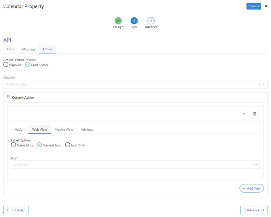
Web View
- Label Option: Choose label option from the following Name Only, Name & Icon or Icon Only
-
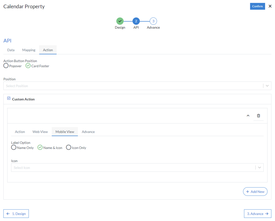
Mobile View
- Label Option: Choose label option from the following Name Only, Name & Icon or Icon Only
-
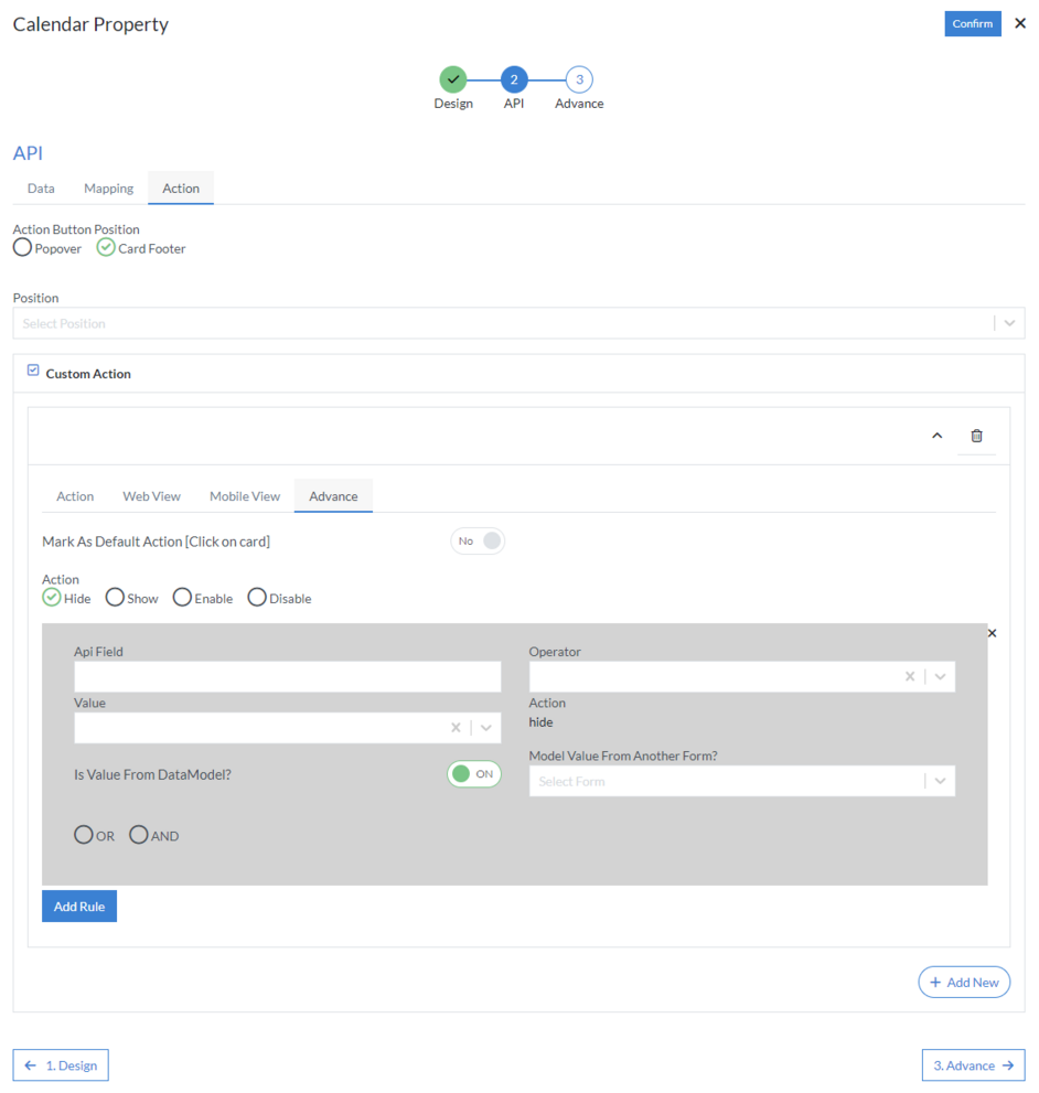
Advance
- Mark As Default Action [Click on card]
- Action: Choose action from the following Hide, Show, Enable or Disable
-
Add Rule
- API Field
- Operator
- Value
- Action
-
Is Value From DataModel
- Model Value From Another Form
-
Action
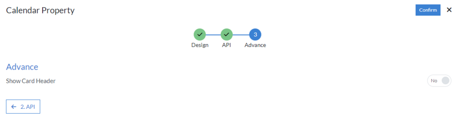
3rd Step – Advance
- Show Card Header
Click “Confirm” and “Calendar” control is configured.