Progressbar
You have to go through a three-step form wizard to enable this Control, i.e., Design, API & Advance. Let’s explain these steps below:
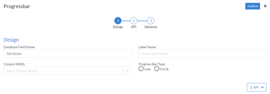
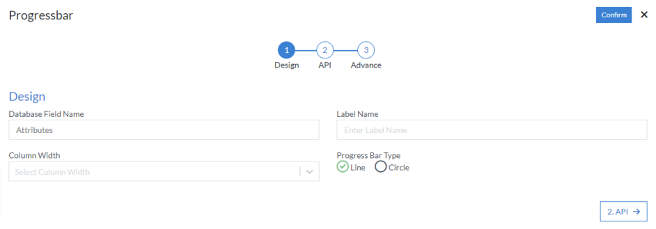
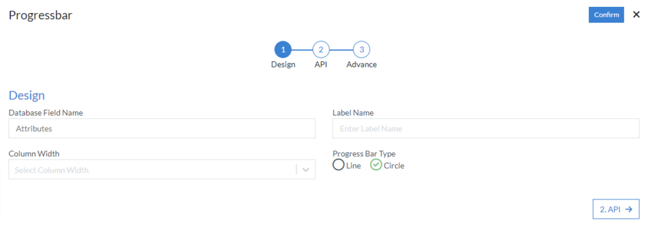
1st Step – Design
- Database Field Name (mandatory): These are the attributes of the form
- Label Name
- Column Width
- Progress Bar Type: Line or Circle
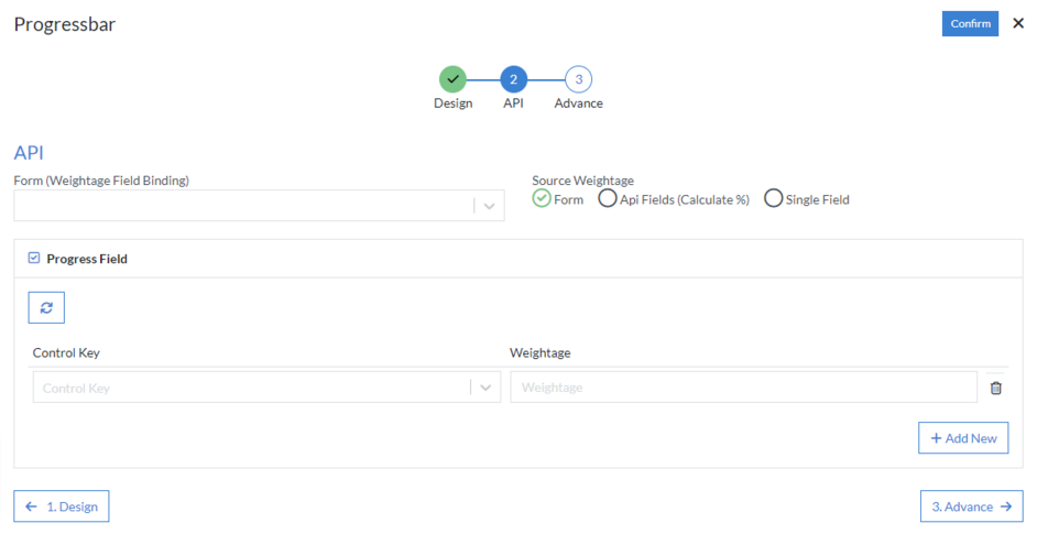
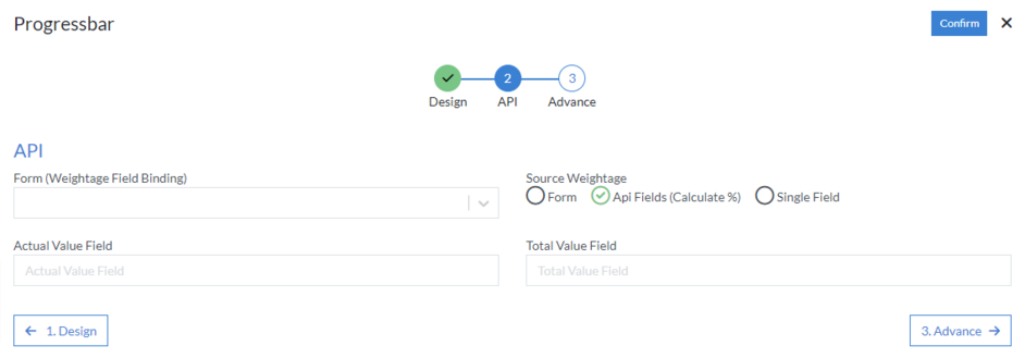
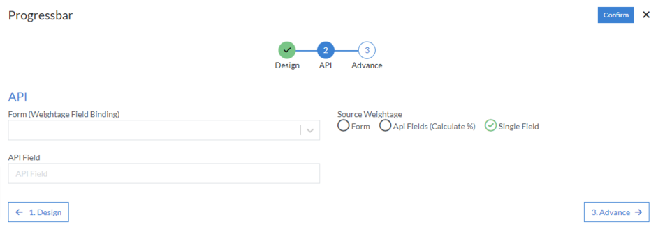
2nd Step – API
- Form (Weightage Field Binding): Select option from the dropdown menu
-
Source Weightage
-
Form
-
Progress Field
- Control Key
- Weightage
-
Progress Field
-
Api Fields (Calculate %)
- Actual Value Field
- Total Value Field
-
Single Field
- API Field
-
Form
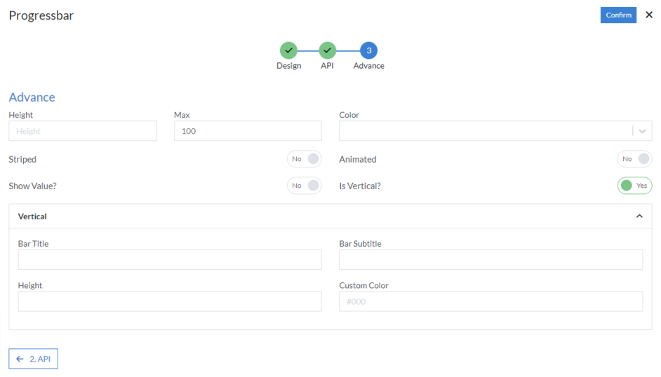
3rd Step – Advance
If “Progress Bar Type” is selected as “Line”, then the following actions should perform as follows:
- Height
- Max
- Color: Select option from dropdown menu
- Striped
- Animated
- Show Value
-
Is Vertical
- Bar Title
- Bar Subtitle
- Height
- Custom Color
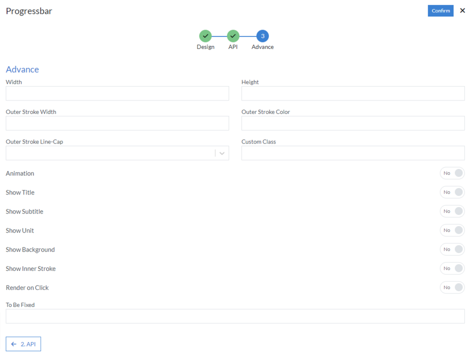
If “Progress Bar Type” is selected as “Circle”, then the following actions should perform as follows:
- Width
- Height
- Outer Stroke Width
- Outer Stroke Color
- Outer Stroke Line-Cap
- Custom Class
-
Animation
- Animation Duration
- Space
- Clock Wise
-
Show Title
- Text Color
- Font Size
- Animate Title
-
Show Subtitle
- Subtitle Text
- Text Color
- Font Size
- Text Animate
-
Show Unit
- Unit
- Font Size
- Color
-
Show Background
- Stroke
- Stroke Width
- Padding
- Background Color
- Opacity
-
Show Inner Stroke
- Stroke Width
- Stroke Color
- Render on Click
- To Be Fixed
Click “Confirm” and “Progressbar” control is configured.