Panel
You may use collapsible or noncollapsible panels to the group and categorize fields in a form.
You have to go through a three-step form wizard to enable this Control, i.e., Design, Validation & Advance. Let’s explain these steps below:
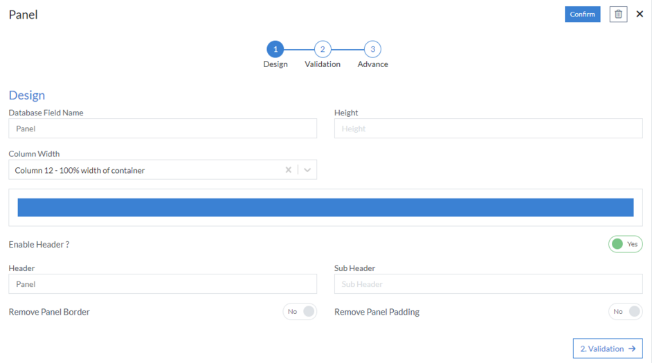
1st Step – Design
This is the first step of the “Panel” layout form wizard. Here you are required to fill in the following details:
- Database Field Name (mandatory): These are the attributes of the form
- Height: Put a numeric value to fix the size of the panel
- Column Width
-
Enable Header?: “Yes” means header of the panel will be visible
on UI, and “No” means header is hidden on UI
- Header
- Sub Header
- Remove Panel Border
- Remove Panel Padding
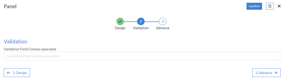
2nd Step – Validation
- Validation Field Comma separated
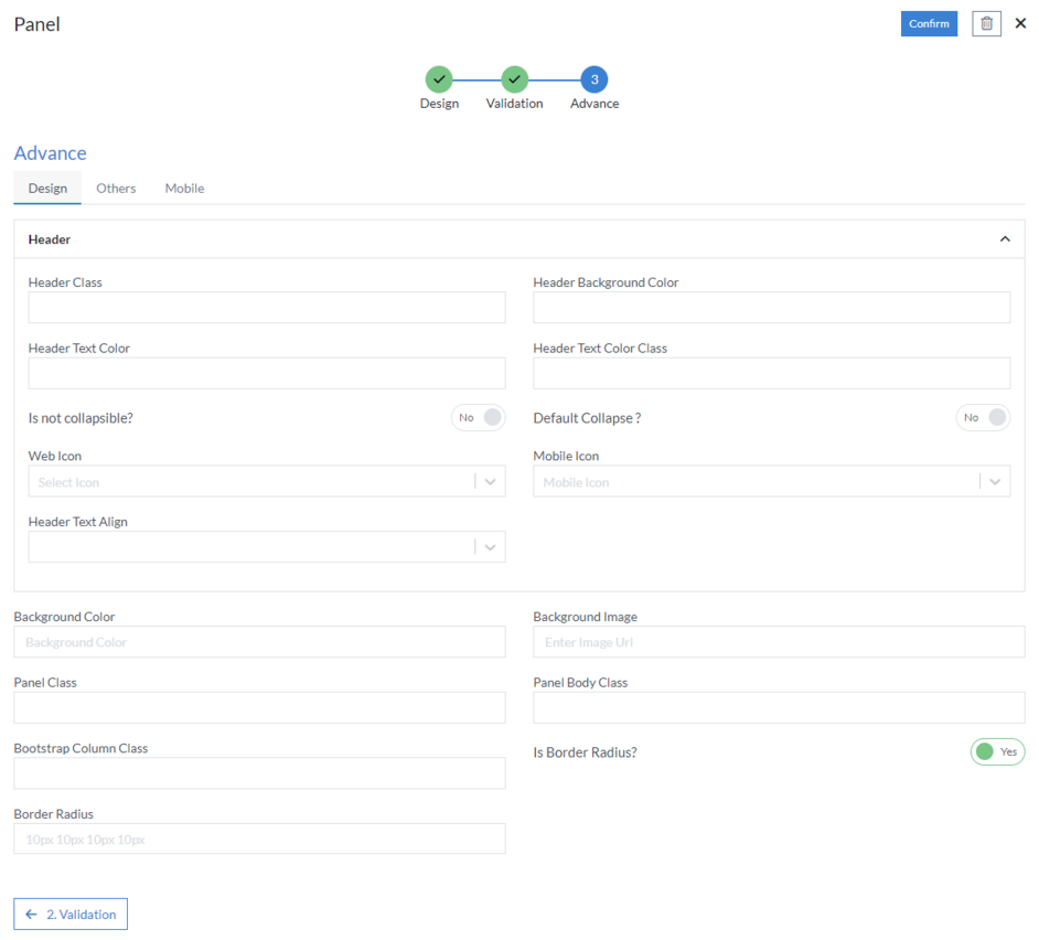
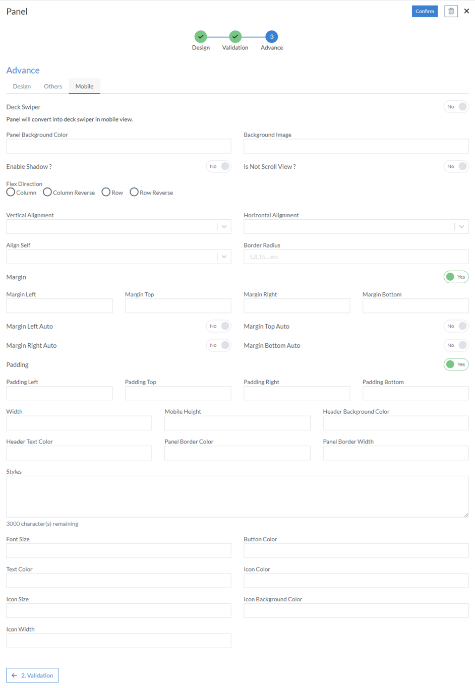
3rd Step – Advance
The following fields in this step can be used to define the UI of the Panel.
- Design
- Header
- Header Class
- Header Background Color
- Header Text Color
- Header Text Color Class
- Is not collapsible
- Default Collapse
- Web Icon
- Mobile Icon
- Header Text Align: Select text position from the following Left, Center or Right
- Background Color: Based on the design, set the color code to set the background color
- Background Image: Add Image URL to set any image as a background image in the panel
- Panel Class
- Panel Body Class
- Bootstrap Column Class
-
Is Border Radius
- Border Radius
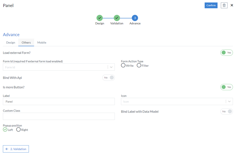
- Others
-
Load external Form
- Form Id (required if external form load enabled)
- Form Action Type
- Bind With Api
-
Is more Button
- Label
- Icon
- Custom Class
- Bind Label with Data Model
- Popup Position
- Mobile
- Deck Swiper: Panel will convert into deck swiper in mobile view
- Panel Background Color
- Background Image
- Enable Shadow
- Is Not Scroll View
- Flex Direction: Select flex direction from the following Column, Column Reverse, Row or Row Reverse
- Vertical Alignment
- Horizontal Alignment
- Align Self
- Border Radius
-
Margin
- Margin Left
- Margin Top
- Margin Right
- Margin Bottom
- Margin Left Auto
- Margin Top Auto
- Margin Right Auto
- Margin Bottom Auto
-
Padding
- Padding Left
- Padding Top
- Padding Right
- Padding Bottom
- Width
- Mobile Height
- Header Background Color
- Header Text Color
- Panel Border Color
- Panel Border Width
- Styles
- Font Size
- Button Color
- Text Color
- Icon Color
- Icon Size
- Icon Background Color
- Icon Width
Click “Confirm” and “Panel” control is configured.